Use the Properties and Events panels to configure the appearance and behavior for your controls.
Each Designer in the AppBuilder workspace includes a properties panel that you can use to configure your properties. The Form Designer, also includes an Events panel that you can use to configure how the control will behave when interacted with. For example, you can specify the behavior of a button when the application user taps it.
Configuring Control Properties
In the form, click on your control to highlight it to display the available properties. You can also select it from the Outline panel.
You can configure how the panel displays the properties by clicking the icons at the top of the panel. These icons allow you to toggle between an alphabetized listing of the properties, and the default categorized listing.
Most properties listed in the General category are simple naming and type properties. The properties listed in the Appearance category are used to assign image files, and associate style choices and cascading styles with your control. For example, when you click the classes property, the Classes Editor will appear, allowing you to add styles from the css folder in the Project Explorer. Each of the properties and categories in which they are grouped will vary based on the control selected.
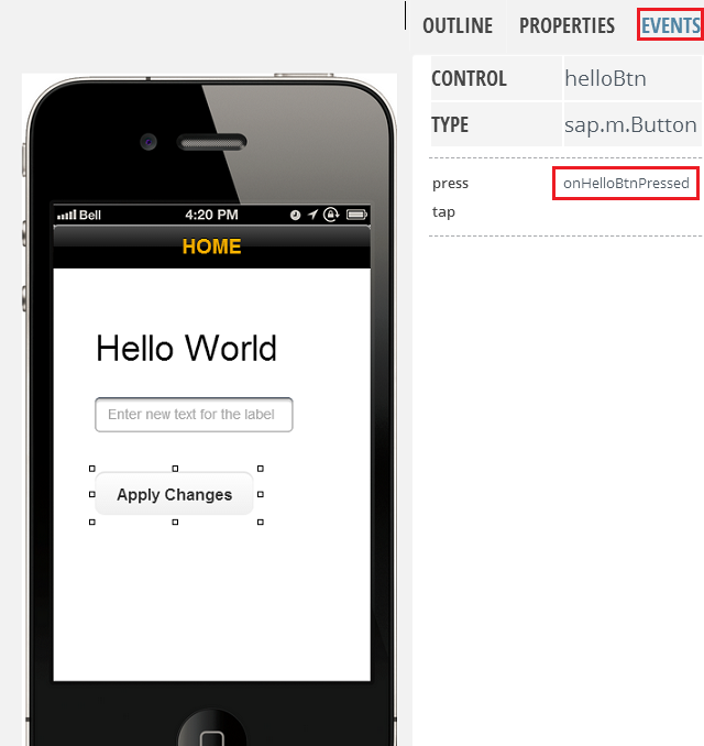
Configuring Control Events
- Select the control you wish to assign event to. In this example, it is the
Apply Changes button
- In the field next to the event you wish to assign, enter the event handler. For example, enter onHelloBtnPressed.
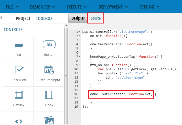
- Click the Source tab to display the source code.
- In the source code, enter the code to specify event handler actions. For
example, enter the script below to specify behavior for the
onHelloBtnPressed event
handler.
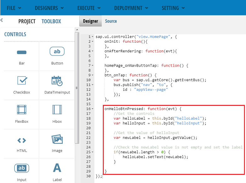
//Get the controls
var helloLabel = this.byId("helloLabel");
var helloInput = this.byId("helloInput");

//Get the value of helloInput
var newLabel = helloInput.getValue();
//Check the newLavel value is not empty and set the label
if(newLabel.length > 0) {
    helloLabel.setText(newLabel);
}
The script is saved to the source code.