MAFUITabBar extends the native MAFUITabBar class with MAF styling capability using the MAFStyling protocol.You can style both the tab bar items and the tab bar itself.
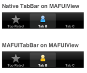
The differences between the native and the SAP-style-based controls are shown here:
Comparison of Native and MAF Tab Bar
To create MAFUIProgressView with the default SAP style and add it to the view
of your ViewController,
use:MAFUITabBar* tabBar = [[MAFUITabBar alloc] initWithFrame:CGRectMake(40, 190, 250, 50)]; [tabBar setMafStyleName:@"UITabBar"];This code creates and styles an empty tab bar.
To fill the tabs with content, create
UITabBarItems:
NSMutableArray *listOfTabBarItems = [[NSMutableArray alloc] init];

UITabBarItem* item = [[UITabBarItem alloc]
				initWithTabBarSystemItem:UITabBarSystemItemTopRated tag:100];

[listOfTabBarItems addObject:item];
[item release];
item = [[UITabBarItem alloc] initWithTitle:@"Tab B"
		image:[UIImage imageNamed:@"employee_grey_24.png"]  tag:1];
[listOfTabBarItems addObject:item];
[item release];
item = [[UITabBarItem alloc] initWithTitle:@"Tab C" image:nil  tag:2];
[listOfTabBarItems addObject:item];
[item release];

[tabBar setItems:listOfTabBarItems];
[listOfTabBarItems release];
MAF does not provide a wrapper class for UITabBarItems. To define a custom style for
MAFUITabBar, use code similar to
this:
<Style BasedOn="TabBar" Key="MyTabBarStyle" platform="ios">
        <Setter Property="Background" Value="#339955"/>
        <BackgroundImage Height="40"        ImageSource="tabBarBackgroundImage.png" Width="40"/>
        <IndicatorImage Height="40"        ImageSource="tab_select_indicator.png" Width="40"/>
        <ShadowImage Height="40"        ImageSource="tabBarUpperShadowImage.png" Width="40"/>
        <Setter Property="selectedImageTintColor" Value="#FF0000"/>
    </Style>
To apply your custom style on MAFUITabBar, set the mafStyleName property to the key
value for your custom
style:tabBar.mafStyleName = @”MyTabBarStyle”;
You can change these properties in the skinning XML:
| Background | Tint color of the MAFUITabBar background; can only be a solid color. |
| BackgroundImage | Image for MAFUITabBar's background. |
| IndicatorImage | Image for MAFUITabBar's indicator. Images can be local or can come from a url and they can be base64 encoded images. |
| ShadowImage | Image for MAFUITabBar's shadow at the top of the control. Available in iOS 6.0 and above. |
| selectedImageTintColor | The tint color of the gradient image used for the selected image. |