MAFUIProgressView extends the native UIProgressView class with MAF styling capability using the MAFStyling protocol.
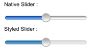
The differences (colors and shadows) between the native and the SAP-style-based controls are
shown here:
Comparison of Native and MAF Progress View Controls
To create MAFUIProgressView with the default SAP style and add it to the view
of your ViewController,
use:UIProgressView* progressview = [[UIProgressView alloc]initWithFrame:CGRectMake(10, 35, 200, 40)]; progressview.progress = 0.5f; [self.view addSubview:progressview]; [progressview release];
As with MAFUISlider, you can skin this control by using tint
colors:
<Style Key="LightProgressBar" TargetType="ProgressView" platform="ios">
        <Setter Property="progressTintColor" Value="#DDDDDD"/>
        <Setter Property="trackTintColor" Value="#666666"/>
    </Style>
To
change the default SAP style to your custom style, set the mafStyleName property to
the key value of your custom
style:progressview.mafStyleName = @"LightProgressBar";
You can change these properties in the skinning XML:
| progressTintColor | The color of the filled portion of the progress bar. Colors are defined as RGBA (red, green, blue, alpha). |
| trackTintColor | The color of the empty portion of the progress. |