MAFUITextField uses the MAFStyling protocol to extend the native UITextField class with MAF styling capability. MAFUITextField can also use different indicators to mark mandatory fields and fields with invalid values.
To create a default SAP- style-based instance of MAFUITextField,
use:
MAFUITextField *textFieldRounded = [[MAFUITextField alloc]
							initWithFrame:CGRectMake(10, 40, 300, 30)] ;
textFieldRounded.borderStyle = UITextBorderStyleRoundedRect;
textFieldRounded.placeholder = @"<enter text>";  //place holder
//explicit call is needed to apply default style.
[textFieldRounded applyMAFStyleWithMandatoryIcon:YES WithErrorIcon:YES UseControlNames:YES];
This code presents this MAFUITextField:
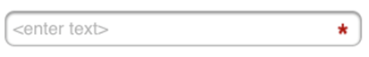
MAFUITextField with Placeholder Text and Mandatory Indicator
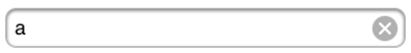
The border, font, and indicator reflect SAP style. The same control can replace the mandatory indicator with a native iOS clear
indicator, which allows you to use the clear feature of the original UITextField:
MAFUITextField with Text and Clear Indicator
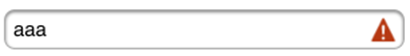
If a validation is attached to MAFUITextField, the clear indicator changes to the
validation error indicator:
MAFUITextField with Text and Validation Error Indicator
This instance of the MAFUITextField calls a method to check whether the field
value is
valid:[textFieldRounded addTarget:self action:@selector(errorCheck:)
forControlEvents:UIControlEventEditingChanged];
The
call is triggered to check the validity of the current value after each additional
character is typed in the text field. There is a separate style to indicate when the MAFUITextField is disabled:
MAFUITextField Disabled

Set indicator images to the MAFUITextField instance to present these UI styles. To
enable mandatory and validation indicators, call the appropriate selector on the
MAFUITextField
instance:
	//Create The Textfields
	textFieldRounded = [[MAFUITextField alloc] initWithFrame:CGRectMake(10, 40, 300, 30)] ;
	textFieldRounded.mafStyleName = @"TextBoxSample";
	textFieldRounded.font = [UIFont systemFontOfSize:17.0];  //font size
	textFieldRounded.placeholder = @"<enter text>";  //place holder
	textFieldRounded.autocorrectionType = UITextAutocorrectionTypeNo;	// no auto correction support
	textFieldRounded.keyboardType = UIKeyboardTypeDefault;  // type of the keyboard
	textFieldRounded.returnKeyType = UIReturnKeyDone;  // type of the return key
//set to apply style with mandatory icon and error icon.
[textFieldRounded applyMAFStyleWithMandatoryIcon:YES WithErrorIcon:YES UseControlNames:YES];
To apply SAP style to MAFUITextField, define these properties in Styles.xml:
    <Style TargetType="TextBox" platform="ios">
        <Setter Property="Background" Value="#FEFEFE"/>
        <Setter Property="FontFamily" Value="Helvetica"/>
        <Setter Property="FontSize" Value="15"/>
        <Setter Property="HorizontalContentAlignment" Value="Left"/>
        <Setter Property="VerticalContentAlignment" Value="Center"/>
        <Setter Property="Foreground" Value="#000000"/>
        <Border BorderBrush="#ABABAB" BorderThickness="1" CornerRadius="8"/>
    </Style>
You can change these properties in the skinning XML:
| Background | Color of the UITextField background; can be only a solid color, no freestyle gradient. Colors are defined as RGBA (red, green, blue, alpha). |
| FontFamily | The control's font family. |
| FontSize | The control's font size. |
| HorizontalContentAlignment | Horizontal alignment of the control's text. |
| Foreground | The color of the control’s text. |
| Border | The border attributes of the MAFUITextField include:
|