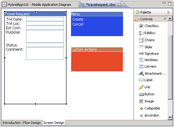
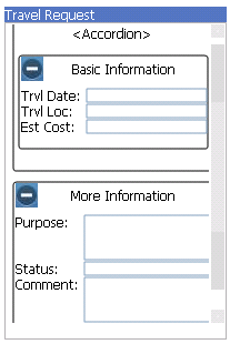
Enable users to expand and collapse screen elements.
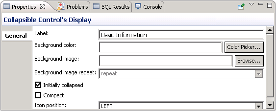
By default, content in a Collapsible control is initially hidden. The
application user can expand the control and show the content by clicking the plus sign icon
beside it. To hide the content again, the user clicks the same icon (now changed to a minus
sign). Collapsible controls can be useful for simplifying the initial screen, while giving
the user control over what content to show.
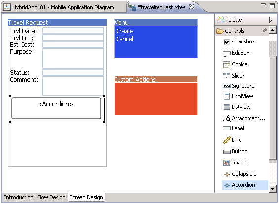
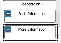
An Accordion control enables you to associate two or more Collapsible controls. By default, only one Collapsible control in the group is expanded at a time: if the user expands one Collapsible control, all the others in the Accordion control are collapsed.
Note: Accordion and Collapsible controls are not supported in Windows Mobile devices: their
content is static, not collapsible.
