Scatter graphs use xy data points to show the relationship between two sets of numeric values.
You can only use numeric values in scatter graphs.
Scatter graphs do not use categories. Instead, numeric values are plotted along both axes, whereas other types of graphs have values along one axis and categories along the other axis.
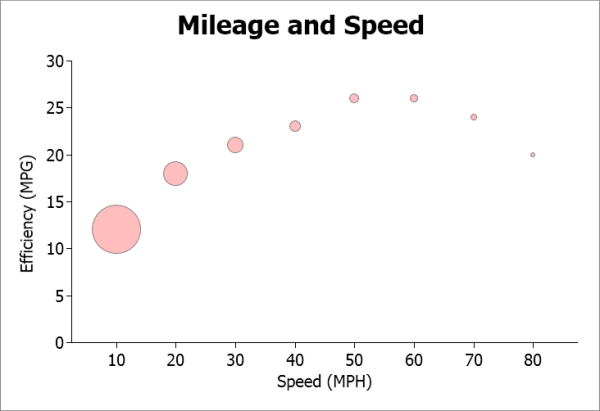
Bubble graphs let you chart three data values in two dimensions, using one x data point and two y data points for each bubble.
For example, the following data shows the effect of speed on the mileage of a sedan, and the number of minutes required to travel a mile at that speed:
| Speed | Mileage | Minutes per mile |
|---|---|---|
| 10 | 12 | 6.00 |
| 20 | 18 | 3.00 |
| 30 | 21 | 2.00 |
| 40 | 23 | 1.50 |
| 50 | 26 | 1.20 |
| 60 | 26 | 1.00 |
| 70 | 24 | 0.86 |
| 80 | 20 | 0.75 |
This scatter graph shows the data from the first two columns:
Scatter graph of the effect of speed on mileage: 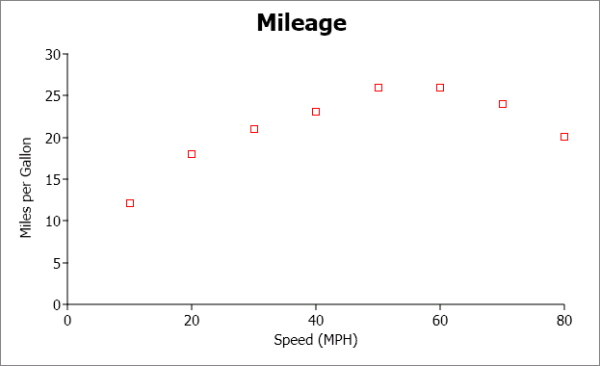
This bubble graph shows the data from all three columns:
Bubble graph of the effect of speed on mileage and distance traveled: