![]()
![]()
![]()
![]()
This section shows how to specify the data for several different graphs of the data in the Printer table in the EAS Demo DB. The table records quarterly unit sales of three printers by three sales representatives.
Rep |
Quarter |
Product |
Units |
|---|---|---|---|
Simpson |
Q1 |
Stellar |
12 |
Jones |
Q1 |
Stellar |
18 |
Perez |
Q1 |
Stellar |
15 |
Simpson |
Q1 |
Cosmic |
33 |
Jones |
Q1 |
Cosmic |
5 |
Perez |
Q1 |
Cosmic |
26 |
Simpson |
Q1 |
Galactic |
6 |
Jones |
Q1 |
Galactic |
2 |
Perez |
Q1 |
Galactic |
1 |
… |
… |
… |
… |
Simpson |
Q4 |
Stellar |
30 |
Jones |
Q4 |
Stellar |
24 |
Perez |
Q4 |
Stellar |
36 |
Simpson |
Q4 |
Cosmic |
60 |
Jones |
Q4 |
Cosmic |
52 |
Perez |
Q4 |
Cosmic |
48 |
Simpson |
Q4 |
Galactic |
3 |
Jones |
Q4 |
Galactic |
3 |
Perez |
Q4 |
Galactic |
6 |
To graph total sales of printers in each quarter, retrieve all the columns into a DataWindow object and create a graph with the following settings in the Data category in the Properties window:
Set DataRows to All
Set DataCategory to quarter
Set DataValues to sum(units for
graph)
Set the DataSeriesOnOff property to False and leave the DataSeries property empty.
The Quarter column serves as the category.
Because the Quarter column has four values
(Q1, Q2, Q3, and Q4), there will be four categories along the Category
axis. You want only one series (total sales in each quarter), so
you can leave the DataSeries box empty, or type a string literal
to identify the series in a legend. Setting DataValues to sum(units
for graph) graphs total sales in each quarter.
Here is the resulting column graph. DataWindow Designer automatically generates the category text based on the data in the table:
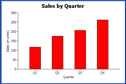
In the preceding graph, there is one set of data points (one series) across four quarters (the category values).
The following is a pie graph, which has exactly the same properties as the preceding column graph except for the type, which is 3D Pie:
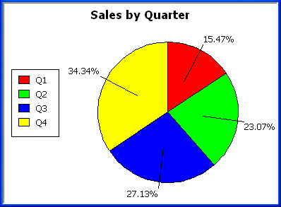
In pie graphs, categories are shown in the legend.
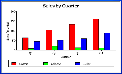
To graph total quarterly sales of each printer, retrieve all the columns into a DataWindow object and create a graph with the following settings in the Data category in the Properties window:
Set DataRows to All
Set DataCategory to quarter
Set DataValues to sum(units for
graph)
Set DataSeriesOnOff to true
Set DataSeries to product
You want a different series for each printer, so the column Product serves
as the series. Because the Product column has
three values (Cosmic, Galactic, and Stellar), there will be three
series in the graph. As in the first example, you want a value for
each quarter, so the Quarter column serves
as the category, and you want to graph total sales in each quarter,
so the DataValues box is specified as sum(units
for graph).
Here is the resulting graph. DataWindow Designer automatically generates the category and series labels based on the data in the table. The series labels display in the graph's legend:
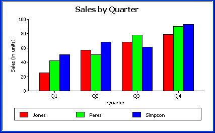
To graph quarterly sales made by each representative, create a graph with the following settings in the Data category in the Properties window:
Set DataRows to All
Set DataCategory to quarter
Set DataValues to sum(units for
graph)
Set DataSeriesOnOff to true
Set DataSeries to rep
Here is the resulting graph: