You can add a custom look and feel to the calendar views either by defining custom subviews, or by using the Skin Manager.
Defining Custom Subviews
public void onCreate(...) {
	super.onCreate(...);

	// inflate the view that embedded the segmented list view
	setContentView(R.layout.the_view_embedding_the_month_view);

	// obtain reference to the list view
MAFCalendarMonthView monthView = (MAFCalendarMonthView) findViewById(R.id. monthView);

// set a custom view provider
	monthView.setViewProvider(new MyViewProvider);

	// set the data provider
	IMAFCalendarDataProvider dataProvider = new MyAppointmentDataProvider();
	listView.setDataProvider(dataProvider);

	// set the time frame to show appointments in.
	// ...
}
Set a MyViewProvider instance as the custom view provider. This class implements the IMAFCalendarMonthViewProvider interface, which can provide a MAFCalendarMonthViewTile typed object for each days via the getMonthTileView(Day dayInfo) method. If the interface method returns null, MAF uses the default tile for drawing the cell view for that day.
class MyViewProvider implements IMAFCalendarMonthViewProvider {

	@Override
	public MAFCalendarMonthViewTile getMonthTileView(Date dayInfo) {

		Calendar calendar = new GregorianCalendar();
		calendar.setTime(dayInfo);
		int year = calendar.get(Calendar.YEAR);
		int month = calendar.get(Calendar.MONTH);
		int day = calendar.get(Calendar.DAY_OF_MONTH);

		MAFCalendarMonthViewTile retView = null;
		if (month == 11 && (day == 24 || day == 25 || day == 26)) {
			// custom view is created for the selected days
			retView =
new MyMAFCalendarMonthViewTile(MonthViewActivity.this);
		}
		return retView;

	}

	@Override
	public MAFCalendarMonthViewTile getMonthTileView(MAFDayInfo dayInfo) {
		// TODO Auto-generated method stub
		return null;
	}
}

class MyMAFCalendarMonthViewTile extends MAFCalendarMonthViewTile {

	public MyMAFCalendarMonthViewTile(Context context) {
		super(context);
	}

	@Override
	public void draw(Canvas canvas) {
		super.draw(canvas);

		InputStream is =
this.getResources().openRawResource(R.drawable.ic_holiday);
		Bitmap myBitmap = BitmapFactory.decodeStream(is);

		Bitmap myScaledBitmap = Bitmap.createScaledBitmap(myBitmap,
getWidth()-15, getHeight()-10, false);
		canvas.drawBitmap(myScaledBitmap, 20, 15, null);
	}
}
In
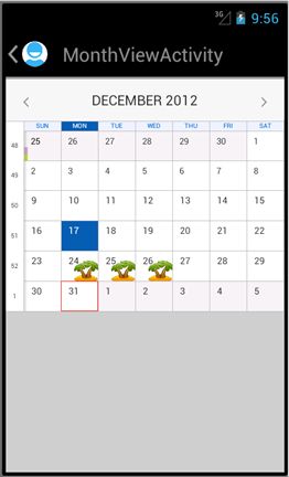
the above code there are two class definitions. The first one is the view provider class that specifies what tile to use for what days. The numbering of months begins with zero, and the day of month returns the number of the day in the given month.
The second class is the view tile class definition that represents a cell of the
month view, and it describes what to draw and how to position the holiday icon
bitmap. This is the result for the example:
To customize the MAF Calendar list view and day view, implment the IMAFCalendarListViewProvider and IMAFCalendarDayViewProvider interfaces, and extend the MAFCaelndarListCellView/MAFCalendarListHeaderView, MAFAppointmentView classes to define your own, custom appereance.
Using the Skin Manager
Use the MAF Skinning MEchanism to modify the appearance of the Calendar without changing the source code. You can change colors, font sizes, add borders and paddings, and so on.
You can skin UI elements and their subviews (for example, list cells) with MAFSkinManager/MAFColorPalette facilities based on a list of accessible parameters.
These are the skinnable properties of the controls that you can adjust in the styles XML:
List View
| Header_Background | Header cell (day) |
| Header_Day_Label_Color | Header cell (day) |
| Header_Date_Label_Color | Header cell (day) |
| Header_Expander_Color | Header cell (day) |
| HeaderCurrentDay_Background | Header cell (current day) |
| HeaderCurrentDay_Day_Label_Color | Header cell (current day) |
| HeaderCurrentDay_Date_Label_Color | Header cell (current day) |
| HeaderCurrentDay_Expander_Color | Header cell (current day) |
| Cell_Background | Appointment Cell |
| Cell_Hour_Label_Color | Appointment Cell |
| Cell_Period_Label_Color | Appointment Cell |
| Cell_Title_Label_Color | Appointment Cell |
| Cell_Location_Label_Color | Appointment Cell |
| Fading_Color | |
| Cell_Selection_Color | Selected cell |
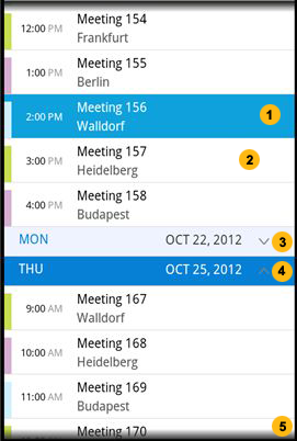
| Number on Figure | Element |
|---|---|
| 1 | Cell (selected) |
| 2 | Appointment cell |
| 3 | Header cell (day) |
| 4 | Header cell (current day) |
| 5 | Fading color |
Month View
| DayTileExtra_Background | DayTileExtra |
| Background | |
| Navigation_Background | Navigation |
| Navigation_Month_Label_Color | Navigation |
| Navigation_Arrow_Color | Navigation |
| DayTile_Day_Label_Color | DayTile |
| DayTile_DayWithApp_Label_Color | DayTile |
| DayTile_Day_Label_Background | DayTile |
| WeekDayHeader_Label_Color | WeekDayHeader |
| WeekDayHeader_Label_Background | WeekDayHeader |
| WeekNumber_Label_Color | WeekNumber |
| Separator_Color | |
| DayTile_Background | DayTile (selected) |
| DayTile_Day_Label_Color | DayTile (selected) |
| DayTile_DayWithApp_Label_Color | DayTile (selected) |
| WeekDayHeader_Label_Background | WeekDayHeader (selected) |
| WeekDayHeader_Label_Color | WeekDayHeader (selected) |
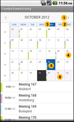
| 1 | Navigation |
| 2 | WeekDayHeader |
| 3 | WeekDayHeader (selected) |
| 4 | DayTile |
| 5 | DayTile (selected) |
| 6 | DayTileExtra |


