MAFUISwitch extends the native UISwitch class with MAF styling capability using the MAFStyling protocol.
This component supports two skinning methods. The first method is to customize the colors of the
native look using tint colors. The second method replaces native images with custom
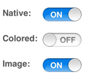
images. The differences between the native and the SAP-style-based controls are
shown here:
Comparison of Native and SAP Style MAFUISwitch


To create MAFUISwitch with the default SAP style and add it to the view of your
ViewController,
use:
MAFUISwitch* sampleSwitch1 = [[MAFUISwitch alloc]
						initWithFrame:CGRectMake(120, 150, 0, 0)];
[mafUIView addSubview:sampleSwitch1];
[sampleSwitch1 release];
With the tint color method, you can change the on and off tint color as well as the
color of the thumb. To define your custom style class for MAFUISwitch,
use:
<Style targettype="Switch" key="SampleSwitch1" platform="ios">
       <Setter property="onTintColor" value="#05FF1A">
       <Setter property="offTintColor" value="#F20202">
       <Setter property="thumbTintColor" value="#FABA00">
 </Style>
To
style the control by replacing the images, set the images from the styling XML:
<Style targettype="Switch" key="SampleSwitch2" platform="ios">
       <Setter property="thumbTintColor" value="#FABA00">
       <OnImage height="30" imagesource="accept_24.png" width="30">
       <OffImage height="30" imagesource="decline_24.png" width="30">
</Style>
You
cannot style the thumb component of MAFUISwitch by replacing its image. The on and
off components can either be skinned with tint color or with an image. You cannot
combine these two methods; you must apply either method consistently to all
components. To apply styles for the MAFUISwitch,
use: MAFUISwitch* sampleSwitch2 = [[[MAFUISwitch alloc]
initWithFrame:CGRectMake(120, 200, 0, 0)] autorelease];
sampleSwitch2.mafStyleName = @"SampleSwitch1";
[mafUIView addSubview:sampleSwitch2];
[sampleSwitch2 release];
You can change these properties in the skinning XML:
| thumbTintColor | The color of the thumb icon. You can set it with both styling methods. Available in iOS 6.0 and above. |
| onTintColor | The color of the ON switch. Cannot be used with the OnImage property. |
| offTintColor | The color of the OFF switch. Cannot be used with the OffImage property. Available in iOS 6.0 and above. |
| OnImage | The image for the ON switch. Cannot be used with the onTintColor property. Available in iOS 6.0 and above. |
| OffImage | The image for the OFF switch. Cannot be used with the offTintColor property. Available in iOS 6.0 and above. |