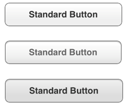
MAFUIButton uses the MAFStyling protocol to extend the native UIButton class with MAF styling capability.
Load the content of Style.xml from MAFUIComponents.bundle, then create and present a default
SAP-style instance of MAFUIButton:
MAFUIButton *stdButton = [[MAFUIButton alloc] initWithFrame:CGRectMake(60, 30, 200, 40)];
[stdButton setTitle:@"Standard Button" forState:UIControlStateNormal];
[self.view addSubview:stdButton];
//release mafUIView instance if not ARC based project.
[stdButton release];
SAP Style Compliant UIButtons – Enabled, Disabled, and Highlighted Versions


The MAF skinning engine customizes the buttons. To apply SAP style, set the custom style in the XML file for background, shadow, font family, font size, content alignment, foreground, and border.
If you do not set an mafStyleName, the skinning engine applies the style of the
default TargetType, which is Button. This is the XAML content for the current
default style of the Button
TargetType:
<Style TargetType="Button" platform="ios">
	<VisualStates>
		<VisualState Name="Highlighted">
		</VisualState>
		<VisualState Name="Disabled">
		</VisualState>
	</VisualStates>
<Setter Property="Background">
<Setter.Value>
<LinearGradientBrush EndPoint="0.5,1" StartPoint="0.5,0">
	<LinearGradientBrush.GradientStops>
	<GradientStop Color="#FFFFFF" Offset="0.0"/>
	<GradientStop Color="#EFEFEF" Offset="0.65"/>
	<GradientStop Color="#EFEFEF" Offset="1.0"/>
	</LinearGradientBrush.GradientStops>
</LinearGradientBrush>
		</Setter.Value>
	</Setter>
<Setter Property="Shadow" Value="#FFFFFF"/>
<Setter Property="FontFamily" Value="Helvetica-Bold"/>
<Setter Property="FontSize" Value="15"/>
<Setter Property="HorizontalContentAlignment" Value="Center"/>
<Setter Property="VerticalContentAlignment" Value="Center"/>
<Setter Property="Foreground" Value="#333333"/>
<Border BorderBrush="#666666" BorderThickness="1" CornerRadius="8"/>
</Style>
MAFUIButton supports different skins for different visual states of the UIButton. To
set visual states, use the <VisualStates></VisualStates>
tag:
Style BasedOn="stdButton" Key="EmphasizedButton"
        TargetType="Button" platform="ios">
        <VisualStates>
            <VisualState Name="Highlighted">
                <Setter Property="Background">
                    <Setter.Value>
                        <LinearGradientBrush EndPoint="0.5,1" StartPoint="0.5,0">
                            <LinearGradientBrush.GradientStops>
                                <GradientStop Color="#00599A" Offset="0.0"/>
                                <GradientStop Color="#0062A9" Offset="0.5"/>
                                <GradientStop Color="#007AB6" Offset="1.0"/>
                            </LinearGradientBrush.GradientStops>
                        </LinearGradientBrush>
                    </Setter.Value>
                </Setter>
                <Setter Property="Shadow" Value="#004A7D"/>
                <Setter Property="Foreground" Value="#FFFFFF"/>
                <Border BorderBrush="#002D4D" BorderThickness="1.2" CornerRadius="8"/>
            </VisualState>
...
        </VisualStates>
...
</Style>
The
above examples defined the core button skin, but the XAML inheritance capability
also allows you to define child styles, such as
stdButton:<Style BasedOn=”Button” Key=”stdButton” TargetType=”Button” platform=”ios”/>
MAF also includes an EmphasizedButton XAML child style for MAFUIButton. To apply the
child style, change the mafStyleName property of the MAFUIButton
object:
MAFUIButton *empButton = [[MAFUIButton alloc] initWithFrame:CGRectMake(60, 30, 200, 40)];
[empButton setTitle:@"Emphasized Button" forState:UIControlStateNormal];
[empButton setMafStyleName:@"EmphasizedButton"];
[self.view addSubview:empButton];

//release MAFUIButton instance if not ARC based project.
[empButton release];
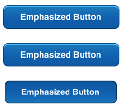
For the emphasized button, the mafStyleName is set to EmphasizedButton (this is the only difference from the basic button). The EmphasizedButton subclass of the stdButton style presents this button on screen:
SAP Style Compliant Emphasized Button – Enabled, Disabled and Highlighted Versions


You can change these properties in the skinning XML:
| Background | Color of the UIButton’s background; can also be a freestyle gradient. Colors are defined as RGBA (red, green, blue, alpha). |
| TextColor | The control's text color. |
| FontFamily | The control's font family. |
| FontSize | The control's font size. |
| HorizontalContentAlignment | Horizontal alignment of the control's text. |
| VerticalContentAlignment | Vertical alignment of the control's text. |
| Border | The border attributes of the UIButton include:
|
| Shadow | The upper shadow (1px horizontal line) for the button. |