Xcode provides graphical editors for creating iOS screens. MAF simple controls support Interface Builder and Storyboard to configure the native subclasses provided by MAF.
There is no support in Xcode to provide pixel-perfect design for custom UIView subclasses. This
is the Interface Builder in Xcode, showing a UIView selected in the visual
editor:
You can adjust this control in the Identity Inspector of the Interface Builder tool. The Class is specified as a MAFUIView. During screen initialization, the iOS framework instantiates the MAFUIView subclass of UIView. This is identical to the instance you get when you use the Objective-C code snippets described in the section; however, here, you need not include a reference to this instance from any UIViewController. If you load the default SAP style, or any custom styling XML file that references the TargetType window, the style is applied to the control.
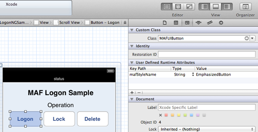
This example shows a UIButton selected in the Interface Builder, and uses the
Identity Inspector to set the Class to MAFUIButton:
<Style BasedOn="stdButton" Key="EmphasizedButton"
        TargetType="Button" platform="ios">
        <VisualStates>
            <VisualState Name="Highlighted">
                <Setter Property="Background">
                    <Setter.Value>
                        <LinearGradientBrush EndPoint="0.5,1" StartPoint="0.5,0">
                            <LinearGradientBrush.GradientStops>
                                <GradientStop Color="#00599A" Offset="0.0"/>
                                <GradientStop Color="#0062A9" Offset="0.5"/>
                                <GradientStop Color="#007AB6" Offset="1.0"/>
                            </LinearGradientBrush.GradientStops>
                        </LinearGradientBrush>
                    </Setter.Value>
                </Setter>
                <Setter Property="Shadow" Value="#004A7D"/>
                <Setter Property="Foreground" Value="#FFFFFF"/>
                <Border BorderBrush="#002D4D" BorderThickness="1.2" CornerRadius="8"/>
            </VisualState>
            <VisualState Name="Disabled">
                <Setter Property="Shadow" Value="#3DBFFF"/>
                <Setter Property="Background">
                    <Setter.Value>
                        <LinearGradientBrush EndPoint="0.5,1" StartPoint="0.5,0">
                            <LinearGradientBrush.GradientStops>
                                <GradientStop Color="#007AB6" Offset="0.0"/>
                                <GradientStop Color="#0062A9" Offset="0.5"/>
                                <GradientStop Color="#00599A" Offset="1.0"/>
                            </LinearGradientBrush.GradientStops>
                        </LinearGradientBrush>
                    </Setter.Value>
                </Setter>
                <Setter Property="Foreground" Value="#FFFFFF"/>
                <Border BorderBrush="#00416E" BorderThickness="1.2" CornerRadius="8"/>
            </VisualState>
        </VisualStates>
        <Setter Property="Background">
            <Setter.Value>
                <LinearGradientBrush EndPoint="0.5,1" StartPoint="0.5,0">
                    <LinearGradientBrush.GradientStops>
                        <GradientStop Color="#007AB6" Offset="0.0"/>
                        <GradientStop Color="#0062A9" Offset="0.5"/>
                        <GradientStop Color="#00599A" Offset="1.0"/>
                    </LinearGradientBrush.GradientStops>
                </LinearGradientBrush>
            </Setter.Value>
        </Setter>
        <Setter Property="Shadow" Value="#3DBFFF"/>
        <Setter Property="Foreground" Value="#FFFFFF"/>
        <Border BorderBrush="#00416E" BorderThickness="1.2" CornerRadius="8"/>
    </Style>
You
can use the same method to use custom XML classes. To apply the default SAP style on
a control, do not specify a value for mafStyleName in the Identity Inspector. To
apply a specific style, set its key attribute as the value of mafStyleName.
