| Copyright © 2007. Sybase Inc. All rights reserved. |
|
|
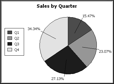
Pie graphs typically show one series of data points with each data point shown as a percentage of a whole. The following pie graph shows the sales for Stellar printers for each quarter. You can easily see the relative values in each quarter. (Sybase WorkSpace automatically calculates the percentages of each slice of the pie.)
You can have pie graphs with more than one series if you want; the series are shown in concentric circles. Multiseries pie graphs can be useful in comparing series of data.
| Copyright © 2007. Sybase Inc. All rights reserved. |
|
|