| Copyright © 2007. Sybase Inc. All rights reserved. |
|
|
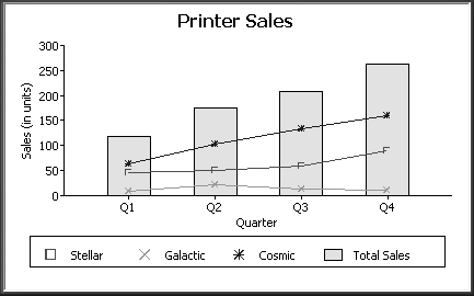
To graph sales in each quarter and overlay the sales of each individual printer, specify the graph's data as in “Graphing unit sales of each printer”, but use the following expression in the Series box:
"Total Sales", "@overlay~t" + product
Here is the resulting graph:
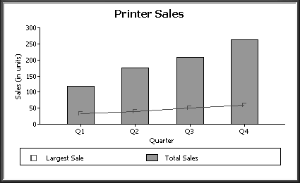
To graph unit sales of printers by quarter and overlay the largest sale made in each quarter, change the Value expression to this:
sum(units for graph), max(units for graph)
Change the Series expression to this:
"Total Sales", "@overlay~tLargets Sale"
Here is the resulting graph:
| Copyright © 2007. Sybase Inc. All rights reserved. |
|
|