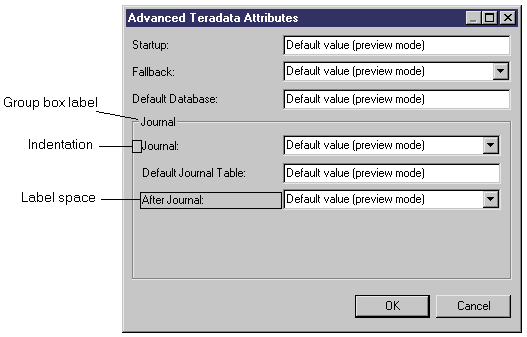
When you add controls to your form, you can specify properties to control their format and contents.
|
Property |
Definition |
|---|---|
|
Name |
Internal name of the control. This name must be unique within the form. The name can be used in scripts to get and set dialog box control values (see Example: Opening a Dialog Box from a Menu). |
|
Label |
Specifies a label for the control on the form. If this field is left blank, the name of the control is used. If you enter a space, then no label is displayed. You can insert line breaks with \n. To create keyboard shortcuts to navigate among controls, prefix the letter that will serve as the shortcut with an ampersand. If you do not specify a shortcut key, PowerDesigner will choose one by default. To display an ampersand in a label, you must escape it with a second ampersand (for example: &Johnson && Son will display as Johnson & Son. |
Attribute |
[included forms] Specifies the object on which the form to be included is defined. The list is populated with all attributes of type object and the following objects:
|
Form name |
[included forms] Specifies the name of the form that will be included. You can:
|
|
Indentation |
[container controls] Specifies the space in pixels between the left margin of the container (form, group box, or horizontal or vertical layout) and the beginning of the labels of its child controls. |
|
Label space |
[container controls] Specifies the space in pixels reserved for displaying the labels of child controls between the indentation of the container and the control fields. To align controls with the controls in a previous container, enter a negative value. For example, if you have two group boxes, and want all controls in both to be aligned identically, set an appropriate indentation in the first group box and set the indentation of the second group box to -1. If a child control label is larger than the specified value, the label space property is ignored; to display this label, you need to type a number of pixels greater than 50.  |
|
Show control as label |
[group boxes] Use the first control contained within the group box as its label. |
|
Show Hidden Attribute |
[extended attributes] Displays controls that are not valid for a particular form (because they do not bear the relevant stereotype, or do not meet the criteria) as greyed. If this option is not set, irrelevant options are hidden. |
|
Value |
[dialog box entry fields] Specifies a default value for the control. For extended attributes, default values must be specified in the attribute's properties (see Extended Attribute Properties). |
|
List of Values |
[combo and list boxes] Specifies a list of possible values for the control. For extended attributes, lists of values must be specified in the attribute's properties (see Extended Attribute Properties). |
|
Exclusive |
[combo boxes] Specifies that only the values defined in the List of values can be entered in the combo box. |
|
Minimum Size (chars) |
Specifies the minimum width (in characters) to which the control may be reduced when the window is resized. |
|
Minimum Line Number |
Specifies the minimum number of lines to which a multiline control may be reduced when the window is resized. |
|
Horizontal Resize |
Specifies that the control may be resized horizontally when the window is resized. |
|
Vertical resize |
Specifies that the multiline control may be resized vertically when the window is resized. |
|
Read-Only |
[included forms and dialog box entry fields] Specifies that the control is read-only, and will be greyed in the form. |
|
Left Text |
[booleans] Places the label text to the left of the checkbox. |
|
Display |
[booleans and methods] Specifies the form in which the boolean options or method button are displayed. For methods, you can choose from a range of standard icons or Text, which prints the text specified in the Label field on the button. |
|
Width/ Height |
[spacers] Specify the width and height, in pixels, of the spacer. |