MAFUISegmentedControl is a subclass of the native UISegmentedControl class, which it extends with MAF styling capability through the MAFStyling protocol.
Default SAP Style Based MAFUISegmentedControl
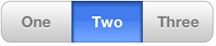
To create MAFUISegementedControl with default SAP style and add it as a subview to
your ViewController,
use:
NSArray *itemArray = [NSArray arrayWithObjects: @"One", @"Two", @"Three", nil];
	UISegmentedControl *segmentedControl = [[[UISegmentedControl alloc] initWithItems:itemArray] autorelease];

segmentedControl.frame = CGRectMake(35, 35, 250, 50);
segmentedControl.selectedSegmentIndex = 1;
[self.view addSubview: segmentedControl];
To change the appearance of the control, define a custom style XML class:
<Style basedOn="SegmentedControl" TargetType="SegmentedControl" Key="mySegmentedControl" platform="ios">
        <Setter Property="TintColor" Value="#00FF99"/>    <!--Tint color only works if the style is UISegmentedControlStyleBar and no image applied -->
        <UnSelectedBackgroundImage Height="30"  ImageSource="segcontrol_uns.png" Width="30"/>
        <SelectedBackgroundImage Height="30"  ImageSource="segcontrol_sel.png" Width="30"/>
        <DividerImageSelUns Height="30"  ImageSource="segcontrol_sel-uns.png" Width="30"/>
        <DividerImageUnsSel Height="30"  ImageSource="segcontrol_uns-sel.png" Width="30"/>
        <DividerImageUnsUns Height="30"  ImageSource="segcontrol_uns-uns.png" Width="30"/>
        <Setter Property="iosStyle" Value="UISegmentedControlStylPlain"/>
    </Style>
To
apply your custom style class, set the key value to match the mafStyleName property
of the
control:segmentedControl.mafStyleName = @"UISegmentedControl";
You can change these properties in the skinning XML:
| FontFamily | The family of the font. |
| FontSize | The size of the label's font. |
| TextColor | The color of the label's text. |
| TintColor | The color used to tint the control. Tint color works only if the style is UISegmentedControlStyleBar and no image is applied. |
| UnSelectedBackgroundImage | The image used to set the backgroundimage of the control when a segment is not selected. |
| SelectedBackgroundImage | The image used to set the backgroundimage of the control when a segment is selected. |
| DividerImageSelUns | The image used to set the dividerimage of the control between the selected segment on the left and the unselected on the right. |
| DividerImageUnsSel | The image used to set the dividerimage of the control between the unselected segment on the left and the selected on the right. |
| DividerImageUnsUns | The image used to set the dividerimage of the control between 2 unselected segments. |
| iosStyle | The iOS style of the control. Possible values:
|