MAF provides skinnable subclasses of native bar types: the MAFUIToolbar and the MAFUINavigationBar. You can populate the native bar controls with MAFUIBarButtonItem instances. All of these components extend their superclass with MAF styling capability using the MAFStyling protocol.
The default SAP style of the MAFUIToolbar and MAFUIBarButtonItem looks like this:
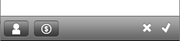
SAP Sytle Compatible MAFUIToolbar
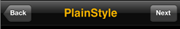
The default SAP style of the MAFUINavigationBar looks like this:SAP Style Compatible MAFUINavigationBar
To present the MAFUIToolbar or MAFUINavitationBar, create an instance of the
UINavigationController. To use the subclasses of the bar types capable of MAF
styling, pass the classes when creating the
instance:
/*
In AppDelegate.m or where we initialize the Navigation Controller.
*/
self.navigationController = [[[UINavigationController alloc]
initWithNavigationBarClass:[MAFUINavigationBar class]
toolbarClass:[MAFUIToolBar class]] autorelease];
/*
In the ViewController where we would like to use the ToolBar and the NavigationBar
*/

MAFUIBarButtonItem *item = [[[MAFUIBarButtonItem alloc]
					initWithImage:[UIImage imageNamed:@"employee_grey_24.png"]
					style:UIBarButtonItemStylePlain target:self action:nil] autorelease];
item.mafStyleName = @"UIBarButtonItem";

MAFUIBarButtonItem *item2 = [[[MAFUIBarButtonItem alloc]
					initWithImage:[UIImage imageNamed:@"lead_grey_24.png"]
					style:UIBarButtonItemStylePlain target:self action:nil] autorelease];
item2.mafStyleName = @"UIBarButtonItem";

UIBarButtonItem *flexibaleSpaceBarButton = [[[UIBarButtonItem alloc]
					initWithBarButtonSystemItem:UIBarButtonSystemItemFlexibleSpace
					target:nil action:nil] autorelease];

MAFUIBarButtonItem *item3 = [[[MAFUIBarButtonItem alloc]
					initWithImage:[UIImage imageNamed:@"decline_24.png"]
					style:UIBarButtonItemStylePlain target:self action:nil] autorelease];
item3.mafStyleName = @"plainBarButton";

MAFUIBarButtonItem *item4 = [[[MAFUIBarButtonItem alloc]
					initWithImage:[UIImage imageNamed:@"accept_24.png"]
					style:UIBarButtonItemStylePlain target:self action:nil] autorelease];
item4.mafStyleName = @"plainBarButton";

/*Create an array of Items*/
NSArray *toolbarItems = [NSArray arrayWithObjects:item, item2, flexibaleSpaceBarButton, item3, item4, nil];
/*Present array of Items on the tooblar*/
[self setToolbarItems:toolbarItems animated:YES];
/*Unhide toolbar of Navigation Controller*/
[self.navigationController setToolbarHidden:NO animated:YES];

// rightbutton to the navbar
MAFUIBarButtonItem *mafButton = [[MAFUIBarButtonItem alloc]
						initWithTitle:@"MAF"
						style:UIBarButtonItemStylePlain
						target:self
						action:nil];
self.navigationItem.rightBarButtonItem = mafButton;
[mafButton release];
MAFUIToolBar
To change the style of the MAFUIToolbar, define your custom style XML
class:
<Style basedOn="ToolBar" Key="MyToolBar" platform="ios">
        <Setter Property="IosStyle" Value="UIBarStyleBlackOpaque"/>
        <Setter Property="TintColor" Value="#666666"/>
        <ShadowImage ImageSource="navBarShadow.png"/>
        <BackgroundImage Height="30"  ImageSource="surf_gradient_textured_44.png" Width="30"/>
    </Style>
To apply this style, set the key value to the mafStyleName property:
/*
In AppDelegate.m or where we initialize the Navigation Controller.
*/
[(MAFUIToolBar*)self.navigationController.toolbar setMafStyleName:@"UIToolBar"];
You can change these properties in the skinning XML:
| ShadowImage | The image used for the shadow. Available in iOS 6.0 and above. |
| IosStyle | The iOS style for the toolbar. Possible values are UIBarStyleDefault, UIBarStyleBlack. |
| TintColor | The tint color of the toolbar. Colors are defined as RGBA (red, green, blue, alpha). |
| BackgroundImage | The image used for the background. |
MAFUINavigationBar
To change the style of the MAFUINavigationBar, define your custom style XML
class:
<Style basedOn="NavigationBar" Key="MyNavigationBar" platform="ios">
        <Setter Property="BarStyle" Value="1"/>
    </Style>
To
apply this style, set the key value to the mafStyleName
property:/* In AppDelegate.m or where we initialize the Navigation Controller. */ [(MAFUINavigationBar*)self.navigationController.navigationBar setMafStyleName:@"UINavigationBar"];
You can change these properties in the skinning XML:
| TintColor | Color of the control's background; can only be a solid color, no freestyle gradient. Colors are defined as RGBA (red, green, blue, alpha). |
| ShadowImage | The image at the bottom of the control. Available in iOS 6.0 and above. |
| FontFamily | The font family of the navigation bar’s text. |
| FontSize | The font size of the navigation bar’s text. |
| TextColor | The color of the navigation bar’s text. |
| BackgroundImage | The background image of the control. Set this property only if you do not use TintColor. |
| BackgroundImageLanscapePhone | The background image of the control for iPhone, landscape view. Set this property only if you do not use TintColor. |
| iosStyle | The iOS style for the control. Possible values: UIBarStyleDefault, UIBarStyleBlack. |
MAFBarButtonItem
You can populate both of the bar types with MAFUIBarButtonItem instances. To change
the style of an individual MAFUIBarButtonItem, define your custom style XML
class:
<Style basedOn="BarButtonItem" Key="MyBarButtonItem" platform="ios">
        <Setter Property="iosStyle" Value="UIBarButtonItemStyleBordered"/>
    </Style>
To
apply this style on the control, set the key value to the mafStyleName
property:[mafItem setMafStyleName:@"SampleBarButton"];
You can change these properties in the skinning XML:
| Background | Color of the control's background; can only be a solid color, no freestyle gradient. Colors are defined as RGBA (red, green, blue, alpha). |
| IosStyle | The iOS style for the control. Possible values: UIBarButtonItemStylePlain, UIBarButtonItemStyleBordered, UIBarButtonItemStyleDone. |
| TintColor | Color of the control's background; can only be a solid color, no freestyle gradient. Colors are defined as RGBA (red, green, blue, alpha). |
| BackgroundImage | The background image of the control. Set this property only if you do not use TintColor. |