MAFUISlider extends the native UISlider class with MAF styling capability using the MAFStyling protocol.
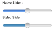
The differences (colors and shadows) between the native and the SAP-style-based slider controls
are shown here:
Native and Styled Slider
To create MAFUISlider with the default SAP style and add it to the view of your
ViewController,
use:
UISlider* slider = [[UISlider alloc]initWithFrame:CGRectMake(10, 185, 200, 30)];
	slider.minimumValue = 0.0;
	slider.maximumValue = 100.0;
	[slider setValue:50];
	slider.continuous = YES;
	[self.view addSubview: slider];
	[slider release];
There are two styling methods available for changing the default style of
MAFUISlider. You can set tint colors for the minimum track, maximum track, and
thumb. This method keeps the native design, but adjusts its colors to the specified
tint colors. To set the tint color at runtime,
use:
<Style Key="LightSlider" TargetType="Slider" platform="ios">
     <Setter Property="minimumTrackTintColor" Value="#FFFFFF"/>
     <Setter Property="maximumTrackTintColor" Value="#FFFF00"/>
     <Setter Property="thumbTintColor" Value="#FF0000"/>
</Style>
The
other method of customizing the control is to specify images for the maximum track,
minimum track, and thumb; for example:
<Style Key="LightSlider" TargetType="Slider" platform="ios">
     <CurrentThumbImage Height="30"  ImageSource="thumb" Width="30"/>
     <MinimumValueImage Height="30"  ImageSource="noSwitch.png" Width="30"/>
     <MaximumValueImage Height="30"  ImageSource="yesSwitch.png" Width="30"/>
</Style>
To
change the default SAP style to your custom style, set the mafStyleName property to
your custom style’s key
value:slider.mafStyleName = @"LightSlider";
You can change these properties in the skinning XML:
| minimumTrackTintColor | The tint color of the standard minimum track images. |
| maximumTrackTintColor | The tint color of the standard maximum track images. |
| thumbTintColor | The tint color of the standard thumb images. Can be used only if no thumb image is used. |
| CurrentThumbImage | Contains the current thumb image that renders the receiver. Overwrites thumbTintColor. |
| MinimumValueImage | Contains the image that is drawn on the side of the slider representing the minimum value. |
| MaximumValueImage | Contains the image that is drawn on the side of the slider representing the maximum value. |