Default SAP Style is applied during initialization of the calendar controls. To change the appearance of calendar controls, edit the defaultSAPStyles.xml file, which is in the MAFUIComponents.bundle folder.
The style names in defaultSAPStyles.xml file use the MAFCalendar prefix in their property IDs.
You can simultaneously skin all controls of an object type by changing the skinning XML provided by the MAF. This works similarly to the iOS-provided Appearance API.
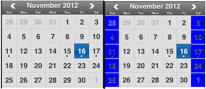
To skin dedicated MAFCalendarItemViews (for instance, in the MAFMonthCalendarView), supply your own subclass of the MAFCalendarItemView and decide whether to change the MAF style name. Use the MAFCalendarViewDataSource protocols calendarView: forDay: method for this.
#pragma mark - MAFCalendarViewDataSource

-(MAFMonthCalendarItemView*)calendarView:(MAFMonthCalendarView*)sender forDay:(NSDate*)day{
    MAFMonthCalendarItemView* myItemView = [[MAFMonthCalendarItemView alloc] initWithFrame:CGRectZero date:day];

    NSCalendar *calendar = [NSCalendar currentCalendar];
    NSRange weekdayRange = [calendar maximumRangeOfUnit:NSWeekdayCalendarUnit];
    NSDateComponents *components = [calendar components:NSWeekdayCalendarUnit fromDate:day];
    NSUInteger weekdayOfDate = [components weekday];

    if (weekdayOfDate == weekdayRange.location || weekdayOfDate == weekdayRange.length) {
        //the date falls somewhere on the first or last days of the week
        NSLog(@"weekend!");
     //Should be able to skin by specifying a custom copy of CalendarMonthViewDayTile in welterStyle.xml
	//myItemView.dayBackgroundColor = [UIColor blueColor];
    		myItemView.styleForDayTile = @”CustomCalendarMonthViewDayTile”
	}


    return myItemView;
}
<Style Key="CustomCalendarMonthViewDayTile" TargetType="Control" platform="ios">
        <Setter Property="Background" Value="#0276FD"/>
        <!-- FINISHED Welter -->
        <Setter Property="Shadow" Value="#FFFFFF"/>
        <!-- FIXME Welter -->
        <Setter Property="FontFamily" Value="Helvetica-Bold"/>
        <!-- FINISHED Welter-->
        <Setter Property="FontSize" Value="23"/>
        <!-- FINISHED Welter -->
        <Border BorderBrush="#AAAEB6" BorderThickness="1"/>
        <!-- FINISHED -->
    </Style>
Subsections point out the elements of the Calendar control that can be styled and show the XML elements or class properties that influence their styles.