MAFUIActivityIndicator is a subclass of the native UIActivityIndicator class, which it extends with MAF styling capability through the MAFStyling protocol.
This control has its own ViewController, which handles the full life cycle of the view it
presents. The control provides a skinnable activity-blocking indicator that scales
to, and blocks the full screen, making it impossible for the device user to interact
with blocked controls. Use MAFUIActivityIndicator in applications that start long
network or processing operations.
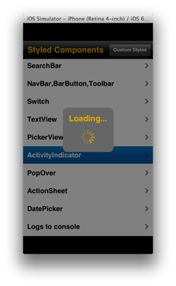
MAFUIActivityIndicator – Default SAP Style
To present the control, create an instance of it and call its
showWithParentViewController:
method:
MAFUIActivityIndicator* activityIndicator = [[MAFUIActivityIndicator alloc] initWithFrame:self.view.frame labelText:@"Loading..."];
[activityIndicator showWithParentViewController:self];
You can adjust the text of the activity indicator. Pass the reference of the currently presenting ViewController, because only the ViewController that presented the control can hide it:
[activityIndicator hide];
[activityIndicator release];
When you call the hide method of the MAFUIActivityIndicator, it calls the retained reference of the presenting ViewController to refresh the presented window without the Activity Indicator. This way you can call the release method on the MAFUIActivityIndicator immediately after it has been hidden.
To change the appearance of the control, declare your custom style XML class:
<Style basedOn="ActivityIndicator" Key="myActivityIndicator"> platform="ios">
        <Setter Property="FontFamily" Value="Helvetica" />
        <Setter Property="FontSize" Value="16" />
        <Setter Property="TextColor" Value="#666666"/>
        <Setter Property="spinnerColor" Value="#666666"/>
        <Setter Property="boxColor" Value="#F0AB00"/>
    </Style>
To
apply a custom style to the control, use:
activityIndicator.mafStyleName = @"myActivityIndicator";
You can change the these properties in the skinning XML:
| boxColor | Color of the control's background; can only be a solid color. |
| spinnerColor | Color of the control's spinner; can only be a solid color. |
| coverColor | Color of the control's cover; can only be a solid color. |
| FontFamily | The font family of the control's text. |
| FontSize | The font size of the control's text. |
| TextColor | The color of the control's text. |