MAFUIStepper extends the native UIStepper class with MAF styling capability using the MAFStyling protocol.
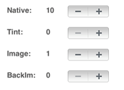
The differences (colors and shadows) between the native and the SAP-style-based controls are
shown here:
Comparison of Native and MAF Stepper Controls
To create MAFUIStepper with the default SAP style and add it to the view of
your ViewController, use:
MAFUIStepper* coloredStepper = [[[MAFUIStepper alloc] initWithFrame:CGRectMake(160, 150, 0, 0)] autorelease];
    [coloredStepper addTarget:self action:@selector(stepperValueChanged:) forControlEvents:UIControlEventValueChanged];
    coloredStepper.tag = 1;
    [mafUIView addSubview:coloredStepper];
There are two styling methods available for changing the default style of
MAFUIStepper. You can set tint colors for the background of the native control,
which keeps the native design, but adjusts the colors to the specified tint colors.
To set the tint color for the background, use:
<Style TargetType="Stepper" Key="TintStepper" platform="ios">
	<Setter Property="TintColor" Value="#00FF99"/>
</Style>
The other method of customizing the control is to specify images for the left and right segments, which provides more variety than setting the tint colors. Provide a left and right segment image for each state of the control; for example:
<Style TargetType="Stepper" Key="ImageStepper" platform="ios">
     <IncrementImage Height="30"  ImageSource="up.png" Width="30"/>
     <DecrementImage Height="30"  ImageSource="down.png" Width="30"/>
</Style>
To
change the default SAP style to your custom style, set the mafStyleName property to
the key value for your custom
style:coloredStepper.mafStyleName = @"TintStepper";
You can change these properties in the skinning XML:
| TintColor | The tint color of the MAFUIStepper. Available in iOS 6.0 and above. |
| BackgroundImage | The image for the background. If you use this property, do not set any other property except DividerImage. Available in iOS 6.0 and above. |
| DividerImage | The divider image that separates the right and the left side of the control. If you use this property, do not set any other property except BackgroundImage. Available in iOS 6.0 and above. |
| IncrementImage | The image for the increment button of MAFUIStepper. If you use this property, do not set any other property except DecrementImage. Available in iOS 6.0 and above. |
| DecrementImage | The image for the decrement button of MAFUIStepper. If you use this property, do not set any other property except IncrementImage. Available in iOS 6.0 and above. |