MAF controls inherit the standard behavior from the native controls. MAF modifies only the appearance of the controls. The MAF skinning mechanism uses a simple text-based configuration that lets you rebrand or reskin applications without requiring source code modifications.
You can easily define the configuration without extensive technical knowledge. Style configurations are simple XML files where you can specify properties for the MAF UI controls. The styling XML also includes inheritance logic which lets you reuse and extend existing components.
See Style Inheritance.
All MAF controls come with a default SAP style that is defined in a styling XML file, which you can find in the resource bundle of the MAFUIComponents library. The default SAP style satisfies the SAP product standards for the look of the UI elements. There is also a hard-coded default skin for all the controls.
To use the MAF skinning feature, configure the appearance of the UI elements in the styling XML and load the file when you launch the application. To use the runtime skinnability capabilities of MAF, you must publish the styling XML file on a remote server. The mobile application must implement logic that calls style-loading code each time it downloads a new version of the configuration bundle.
Creating and Defining a Configuration
The style configuration defines the look of simple MAF controls. Each simple MAF UI control has a matching TargetType in the configuration file. Any properties you set for a TargetType are valid for all the UI elements of that type.
For example, the ListBoxItem TargetType represents the MAFUITableViewCell UI control in the iOS platform.
Skinning based on control type is often too generic, so the style configuration also uses keys to define unique skins for each instance of a TargetType.
A style XML class can declare one key attribute. The value of this attribute is matched with the value of the mafStyleName property, which is defined by the MAFStyling protocol. This lets you bind styles to individual instances of MAF controls.
The MAF skinning engine matches the TargetType attribute to the respective iOS control. The style definitions that expose only a TargetType attribute without a key attribute are applied by MAF only if you do not specify a mafStyleName attribute for the control.
<Style TargetType="NavigationBar" platform="ios">
        <Setter Property="TintColor" Value="#000000"/>
    </Style>

    <Style TargetType="NavigationBar" Key="MyNavigationBar" platform="ios">
        <Setter Property="TintColor" Value="#110000"/>
    </Style>
In more complex MAF UI controls, you can use different styles for the same control. For example, to satisfy your company's style requirements, you can use two different styles for two different types of labels. To change the appearance of complex controls, you may have to change more than one style for the same control.
For the full list of configurable styles, see the descriptive topics and the API documentation for each individual MAF control.
<?xml version="1.0" encoding="utf-8"?>
<styles xmlns="http://schemas.sap.com/maf/2011/sap" xmlns:xsi="http://www.w3.org/2001/XMLSchema-instance" xsi:schemaLocation="http://schemas.sap.com/maf/2011/sap styles.xsd">
	<!-- Apply style specifically to the tree view -->
<Style TargetType="ListBoxItem" Key="UITableViewCell" platform="ios">
			<!-- change background to green -->
			<Setter Property="Background" Value="#00FF00" />
	</Style>
	<!—Apply style to all ListBoxItem -->
	<Style TargetType="ListBoxItem" platform="ios">
			<!-- change background to red -->
			<Setter Property="Background" Value="#FF0000" />
	</Style>
</Styles>
For more complex examples and to see how the SAP style is defined, look at the SAPDefaultStyle.xml resource files that are included in the MAF UI libraries.
A style that is defined for a TargetType using a key does not inherit the style properties of the same TargetType that does not use a key ID.
Loading the Configuration in Code and Applying the Style
#import "MAFUIStyleParser.h" //needed to load default and custom styles for reuse components
…
-(void)loadStyles{
	//locate default SAP Style xml in MAFUIComponents.bundle folder, attahced to the project
	NSString* fname = nil;
	fname = [[[[NSBundle mainBundle] resourcePath]
		stringByAppendingPathComponent:@"MAFUIComponents.bundle"]
		stringByAppendingPathComponent: @"SAPDefaultStyle.xml"];
	//load default SAP Style from xml
	[MAFUIStyleParser loadStyleWithPath:fname withError:nil];
}
Configuration files are loaded incrementally. This means that if you load a new configuration file, it changes the appearance of only the controls that are redefined in the file, and updates only the properties that are explicitly described in the file. This way, you need not copy the entire SAPDefaultStyle.xml to change the appearance of a few controls. Create a new XML file and include only the styles you want to override.
#import "MAFExtensions.h"   //apply MAF Category on all UIViews
...
// in the code, during application running
- (void) viewDidLoad {
	[self loadCustomStyle];
	[self.view mafApplyStyleOnMafSubviews]; //defined in MAFExtensions.h as category
	[self.view reloadInputViews];
}
#import "MAFUIStyleParser.h" //needed to load default and custom styles for reuse components
#import "MAFExtensions.h"   //apply MAF Category on all UIViews
…
- (BOOL) loadDefaultStyle {
	NSString* fname = [[[[NSBundle mainBundle] resourcePath]
				stringByAppendingPathComponent:@"MAFUIComponents.bundle"]
				stringByAppendingPathComponent: [NSString
				stringWithFormat:@"%@.xml", :@"SAPDefaultStyles"]];

	[self loadStyles:fname];
}
- (BOOL) loadCustomStyle {
	NSString* fname = [[[[NSBundle mainBundle] resourcePath]
				stringByAppendingPathComponent:@"MyApplication.bundle"]
				stringByAppendingPathComponent: [NSString
				stringWithFormat:@"%@.xml", :@"CustomStyles"]];
	[self loadStyles:fname];
}
- (BOOL) loadStyles:(NSString*) styleXMLFileName {
	// load specified xml file as Styles XML
	[MAFUIStyleParser loadStyleWithPath:fname withError:nil];
	return YES;
}
// in the code, during application running
- (void) viewDidLoad {
	[self loadDefaultStyle]; // load default SAP style
	[self loadCustomStyle]; // incrementally append styles to the default SAP styles
	[self.view mafApplyStyleOnMafSubviews]; // explicitly apply style on each sub-view
	[self.view reloadInputViews];
}
Style Inheritance
Style inheritance lets you reuse existing components while extending them with
additional capabilities:
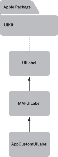
MAF uses style inheritance to reuse styling configuration and minimize duplications.
<Style TargetType="Label" platform="ios">
<Setter Property="FontFamily" Value="Helvetica-Bold"/>
<Setter Property="FontSize" Value="17"/>
<Setter Property="TextColor" Value="#666666"/>
<Setter Property="Background" Value="#00000000"/>
<Setter Property="HorizontalContentAlignment" Value="Center"/>
<Setter Property="VerticalContentAlignment" Value="Center"/>
</Style>
<Style BasedOn="Label" Key="stdLabel" TargetType="Label" platform="ios">
<Setter Property="TextColor" Value="#FFFFFFFF"/>
<Setter Property="Shadow" Value="#FF0000FF"/>
</Style>
<Style BasedOn="stdLabel" Key="PlainSectionHeaderLabel" TargetType="Label" platform="ios">
	<Setter Property="TextColor" Value="#FFFFFF"/>
</Style>
Styling Different Visual States
Visual states are implemented by native controls. MAF cannot add new visual states; it can style only those states that are already supported. Visual states are declared in the styling XML file:
<Style BasedOn="stdButton" Key="EmphasizedButton"
        TargetType="Button" platform="ios">
        <VisualStates>
            <VisualState Name="Highlighted">
                <Setter Property="Background">
                    <Setter.Value>
                        <LinearGradientBrush EndPoint="0.5,1" StartPoint="0.5,0">
                            <LinearGradientBrush.GradientStops>
                                <GradientStop Color="#00599A" Offset="0.0"/>
                                <GradientStop Color="#0062A9" Offset="0.5"/>
                                <GradientStop Color="#007AB6" Offset="1.0"/>
                            </LinearGradientBrush.GradientStops>
                        </LinearGradientBrush>
                    </Setter.Value>
                </Setter>
                <Setter Property="Shadow" Value="#004A7D"/>
                <Setter Property="Foreground" Value="#FFFFFF"/>
                <Border BorderBrush="#002D4D" BorderThickness="1.2" CornerRadius="8"/>
            </VisualState>
            <VisualState Name="Disabled">
            <!-- declare style properties for the Visual Style here -->
            </VisualState>
            <VisualState Name="State1">
            <!-- declare style properties for the Visual Style here -->
            </VisualState>
            <VisualState Name="State2">
            <!-- declare style properties for the Visual Style here -->
            </VisualState>
...
        </VisualStates>
        <!-- declare style properties for default Visual Style here -->
...
</Style>
The styling XML file uses the VisualState XML tag to declare a group of properties that belong to a specific visual state. The states are identified by the Name property of the VisualState XML tag. A style XML entry can have many VisualState tags, but they must all be declared inside the VisualStates XML tag. When you provide visual states, the MAF skinning engine checks the state of the control and selects the matching visual state style from the style of the control.