In the state editor, you can edit state properties, define follow-up states, test regular expressions for follow-up transitions, and detach the current state from follow-up states.
The state editor window opens automatically when you select a state in the Application Composer. Depending on the state type, the state editor displays various options, context-sensitive links, and entry fields.
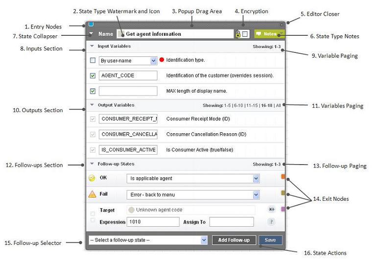
State editor fields and controls are:
- Entry Nodes – identify links to other states that transitions to this state. If you click an entry node, a state editor opens for the corresponding state. If you hover over an entry node, you see the state name with which it is associated.
- State Type Watermark and Icon – icon associated with the state type. The watermark allows you to quickly recognize state types in the editor and in the layout view.
- Pop-up Drag Area – you can move the state editor anywhere within the Application Composer by clicking the header and dragging.
- Encryption – encrypts incoming and outgoing messages, which are saved in message logs.
- Editor Closer – closes the state editor. If you have pending changes that have not been saved, you are prompted to either save or discard these changes.
- State Type Notes – to view or edit notes that describe a state's function, input and output variables, and follow-up state transitions, click the down arrow.
- State Collapser – shrink or enlarge the state editor.
- Inputs Section – input variable names and values. Click the down arrow to close this section.
- Variables Paging for Inputs Section – if a state contains more than five input variables, you can page through the others by selecting the relevant page set. To display all input variables, click All.
- Outputs Section – output variable names and values. Click the down arrow to close this section.
- Variables Paging for Outputs Section – if a state contains more than five output variables, you can page through the others by selecting the relevant page set. To display all output variables, click All.
- Follow-up Section – configure, change, and test follow-up states. To collapse this section, click the down arrow.
- Follow-up Paging – three follow-up states appear on each page. To see more follow-up states, select the relevant page set.
- Exit Nodes – identify links to other states that this state transitions to. If you select an exit node, a state editor opens for the next state. If you hover over an exit node, you see the state name with which it is associated.
- Follow-up Selector – select the follow-up state. All states, except the Goto Application state, allow you to add a follow-up state.
- State Actions – Add Follow-up State and Save.