Use the items on the palette to design the screen for the mobile workflow application.
| Option | Description |
|---|---|
| Menu item | Use to provide additional options for the top-level menu on the screen. |
| Checkbox | Displays a true/false (or yes/no) option on the screen. |
| Editbox | Select the logical type for the edit box, then enter text and assign values to strings, dates, decimals, integers, and so on. |
| Choice | Display a collection of items on the screen as a drop-down list from which the user can choose. |
| Slider | Represent numeric values within a range. |
| Signature | Add a signature box to the screen. The value is a list of points that, combined, make up the signature that gets or is drawn to the control, for example, -1x-1,5x7,5x8,-1x-1, where -1x-1 is interpreted as an interruption of a line drawn to the screen. |
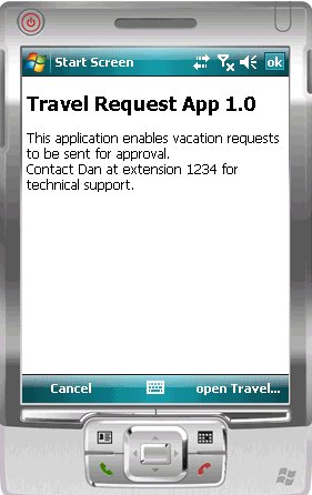
| HtmlView |
Allows text with HTML markup to display on the screen. For example, this code:
<H2>Travel Request App 1.0</H2>
This application enables vacation requests to be
sent for approval.<br>Contact Dan at extension 1234
for technical support.
displays like this on the device:
Note: The HtmlView control fills the entire screen of a workflow form, so no other controls can be placed on a screen that hosts an HtmlView control.
|
| ListView | Displays lines that can be clicked on to show further details of the selected line. This facilitates the navigation for a one-to-many mobile business object relationship. For example, the listview could contain the items of a sales order. When a line in the sales order is clicked on, a details screen for that sales order appears. Note: The ListView control fills the entire screen of a workflow form, so no other controls can be placed on a screen that hosts a ListView control.
|