RadioButtons are round buttons that represent mutually exclusive options. They always exist in groups. Exactly one RadioButton is selected in each group.
When a RadioButton is selected, it has a dark center; when it is not selected, the center is blank.
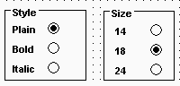
In the following example, the text can be either plain, bold, or italic (plain is selected):

When the user clicks a RadioButton, it becomes selected and the previously selected RadioButton in the group becomes deselected.
Use RadioButtons to represent the state of an option. Do not use them to invoke actions.
When a window opens, one RadioButton in a group must be selected. You specify which is the initially selected RadioButton by selecting the Checked property in the General property page in the RadioButton’s Properties view.
By default, all RadioButtons in a window are in one group, no matter what their location in the window. Only one RadioButton can be selected at a time.
You use a GroupBox control to group related RadioButtons. All RadioButtons inside a GroupBox are considered to be in one group. One button can be selected in each group.
When a window contains several RadioButtons that are outside of a GroupBox, the window acts as a GroupBox. Only one RadioButton can be active at a time unless the check box for the Automatic property on the RadioButton’s General property page is cleared. When the Automatic property is not set, you must use scripts to control when a button is selected. Multiple RadioButtons can be selected outside of a group.
The Automatic property does not change how RadioButtons are processed inside a GroupBox.
