![]()
![]()
![]()
![]()
For photo-realistic images, you do not need to do anything special with them besides resize them. M-Business Client does a pretty good job of dithering the image for the appropriate device. You might want to consider sharpening the image using something like Photoshop's Sharpen filter, which tends to emphasize the lines between contrasting areas. (But do not expect miracles: There is only so much we can do with a 4-color grayscale display.)
For line-art, such as logos and maps, the situation is more complicated. Dithering does not look as good with line art as it does with photographic images. And while there are many devices (like the Palm III) that support only 2-bit, 4-gray images, there are others (like the Palm V) that support 4-bit 16-gray images, while others (like Windows Mobile Pocket PC 2003 machines and the Palm IIIc) use 8-bit color.
There are two strategies one can use when approaching line-art images:
Strategy 1: Design for the lowest common denominator and optimize your images for 4-grayscale displays.
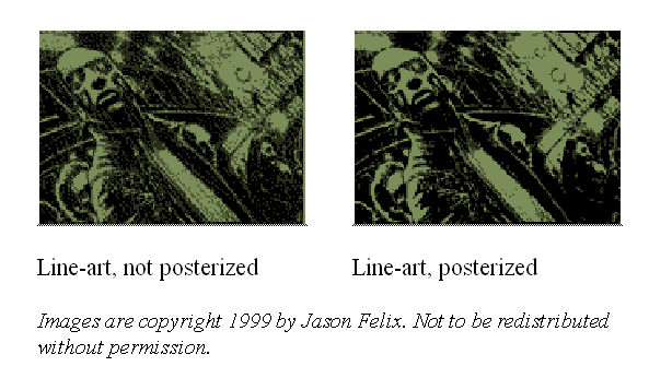
The best way to optimize line-art for 4-color gray is to convert the image to grayscale, use the Image » Adjust » Posterize command in Photoshop, and select 4 levels of gray. This will adjust every color in the image to the closest nondithering gray. Should you choose this strategy, keep in mind you will probably have to redesign your images at some point in the future as color and 16-gray devices become more prevalent.
For example, this is how a line-art drawing looks when viewed on a 4-gray Palm III device. The version on the left is the original image without any modifications, the version on the right is the original image posterized to 4 levels of gray. The version on the right looks a little sharper than the image on the left, although some subtle detail is missing.
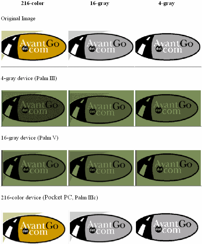
Strategy 2. Design for the best quality on the more advanced devices. The best way to optimize line-art for color is to convert it to the 216-color Web palette, as that is the palette that the M-Business Client browser uses. Most graphics programs give you the option to save your image as a 216-color Web-safe palette image.
As a quick demonstration, this is how our logo looks as a 216-color Web-safe image, a 16-color posterized grayscale image, and a 4-color posterized grayscale image. Not surprisingly, the 4-gray image looks best on the 4-gray device, the 16-gray image on the 16-gray device, and the 216-color image on the 216-color device.
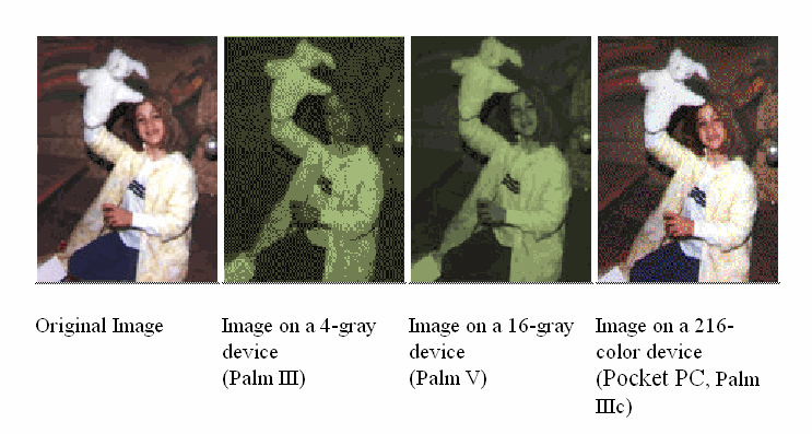
The figure below shows how a typical photo looks on the various devices.
It is also possible to deliver different content depending on the screen size and color depth of the device, which can provide the best quality image on all platforms. For more information, see Using server URL macros to customize content and Using M-Business Client HTTP request headers to customize content.
Of course, the real key to increasing the quality of your channel is to test it thoroughly. See Testing your M-Business channel.
| Send feedback about this page using email. | Copyright © 2008, iAnywhere Solutions, Inc. |